How to Design A Converting Home Page for Your Therapy Website
When you are crafting your home page for your therapy website, you are starting a really exciting task. Everything is so new and you are ready to tell the world you want to help your clients. With all this excitement, it can easily happen therapists get carried away and start telling clients about all their certifications, skills and journey - but totally forget to talk about the transformation and results therapy clients get when they work with you as a therapist.
With your home page as the “virtual business card” of your therapy practice, it is crucial you are spending the majority of the time thinking about how to craft it on-point.
To ensure your therapy practice home page creates a compelling online presence that captivates your website visitors and turns them into loyal clients, we've prepared this valuable guide.
Let’s start:
1. Develop your therapy brand
Every great home page starts with a dash of charisma and a sprinkle of pizzazz. Picture your private practice as a brand with its own personality traits and quirks. Are you a spark of light and happiness or more conservative? Maybe you want to create a warm and earthy sense of trust? Embrace your brand's essence and infuse it into every pixel of your home page design.
👉 Learn more about personal branding as a therapist here!
2. Use visuals that align with your therapy brand
As therapists, you understand the importance of captivating your audience's senses and emotions. Your home page serves as a captivating venue, drawing visitors in to experience your practice. Finding and using visually engaging graphics, calming colors, and emotionally connecting imagery that reflects your therapy practice’s narrative is important to transport the sense of what your clients can expect from you as.
Avoid overwhelming your website visitors with an excessive array of colors, animations, and text. Instead, allow your website to breathe with the clever use of white space, ensuring a high-converting and appealing design.
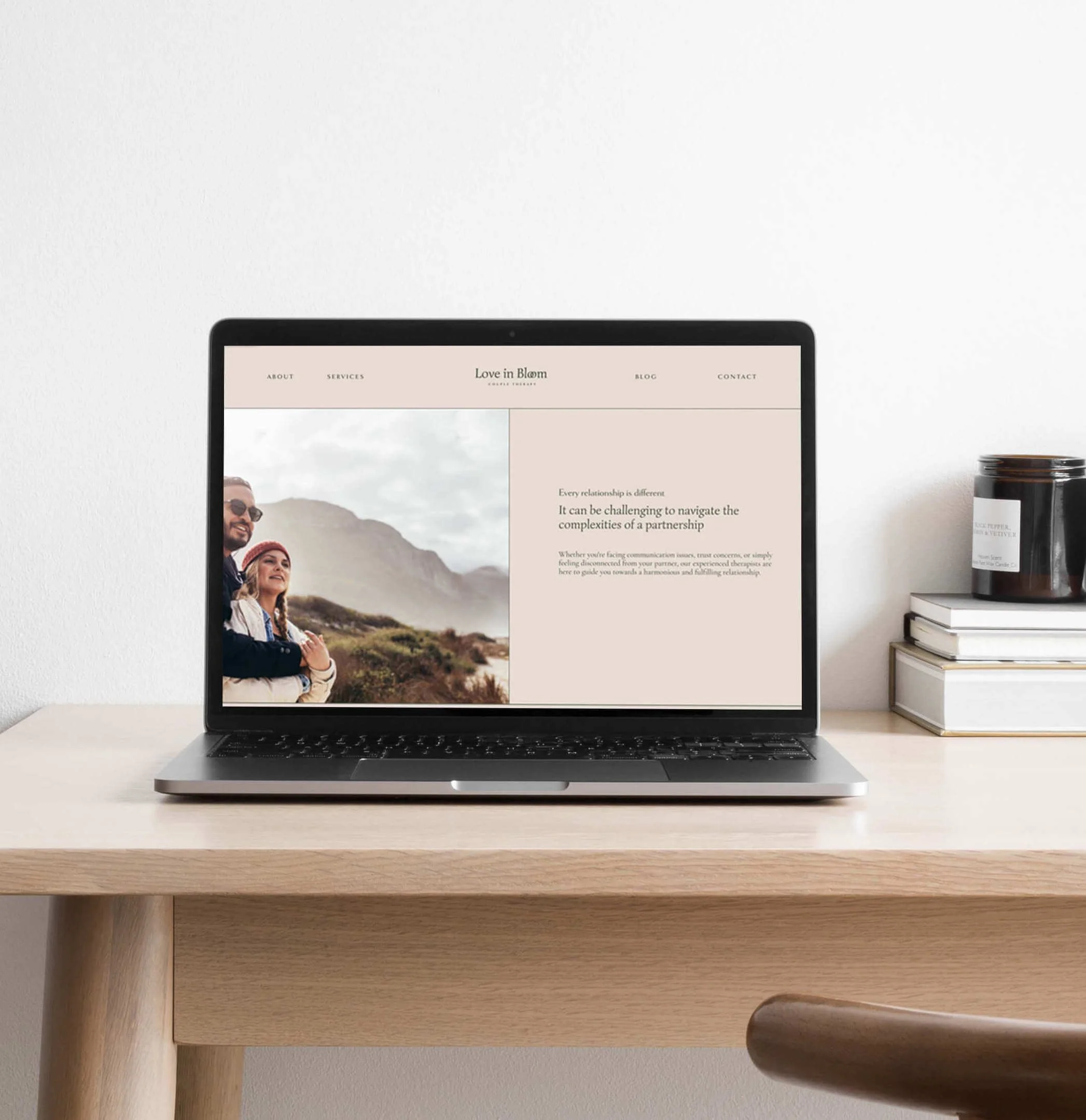
Here are two exemplary website header examples that illustrate this concept beautifully. Each has a clear navigation, ample white space, and images that convey the essence of the website while harmonizing aesthetically with the overall color scheme.
Both of these website header examples are for a therapist specialising in relationship counseling:
Example #1: Website Header Example for a Therapist Website
You can see how the image shows a happy couple and the short headline is places beautifully and intentionally in the bright part of the image to have enough contrast to make the text readable.
Example #2: Website Header Example for a Therapist Website
On this therapy website page, the happy couple looks into the direction of the text. The text has white space to give it significance and focus. This provides space for more text without being overwhelming.
Finding and selecting images that work well with the your overall therapy website branding is essential to the user experience. If your website visitor finds your therapy website paints a picture, they will be at ease scrolling through your website and take their time. Visuals capture emotions and need to work in alignment with your website copy to create a great impact.
👉 Learn more about website aesthetics and learn how to avoid these 7 deadly website mistakes!
3. Create a headline your therapy clients can emotionally connect to
While other landing pages need a bit more of an attention grabbing headline, I would not recommend the same for therapists, counselors or psychologist for this particular reason: You are an empathetic carer for your patients. Connecting with them emotionally is way more important than getting immediate attention. Ideally, your clients let their eyes wander over your header image first - see themselves in it (in their ideal stage after working with you) and THEN read your header text, speaking exactly to what they are craving while feeling heard and see.
Here is how to achieve that:
How to craft your emotionally connecting headline:
Know Your Clients: Understand your target clients and their pain points. Your headline should directly address their needs and desires, showing how your product or service can provide a solution or benefit. Think about how your service or product helps them achieve their goals, dreams and vision. What transformation are they going through with you?
Keep it Clear and Simple: Keep your headline easy to understand. Avoid using complex therapist jargon that may confuse visitors. Don’t stay “EMDR for you” but rather “Connect with your emotions and start taking control of your life” If it requires a dictionary to decipher your message, consider simplifying it. Clarity is key – if a toddler can understand it, it's perfect.
Highlight Your Unique Value: Focus on what sets your therapy practice apart from others. Emphasize the specific benefits clients will gain by choosing your services.
Use Action-Oriented Language: Incorporate action verbs that prompt visitors to take specific actions. Phrases like "Discover," "Get Started," "Transform Your," or "Unlock" create a sense of urgency and encourage further exploration.
Evoke Emotions: Connect with your audience on an emotional level by using powerful and resonant words. Emotionally appealing headlines can foster a stronger bond with your brand and drive engagement.
Incorporate Relevant Keywords: If possible, include relevant keywords in your headline to improve your website's visibility in search engine results and attract organic traffic. If you are a therapist who has an in-house practice you’d like clients to come to, try to incorporate the keyword for your local area. For example, if you are a therapist in Sydney, then use “Therapist in Sydney” or “Therapy Practice in Sydney” to be found on Google. You can also be more specific a use a suburb area, for example “Inner West Therapist” or “Therapist in Newtown”. Create your google business account and list your business on Google maps. This way, clients in your area can easily find you.
Solve a Problem: Frame your headline around a common problem your clients are facing and highlight how your therapy services provide the solution they seek.
Remember that the headline is often one of the first thing visitors see, so investing some time and effort into crafting your therapy website headline will be beneficial.
Therapy Website Headline examples for private practices:
For a Counselor:
"Empower Your Mind: Professional Counseling for Positive Change"
"Reconnect with Yourself: Counseling Services for Inner Harmony"
For a Physiotherapist:
"Heal Your Body, Restore Your Strength: Expert Physiotherapy Services"
"Move Freely, Live Fully: Expert Physiotherapy for Pain Relief"
For a Therapist:
"Start Your Transformation and Personal Growth"
"Mental Wellness Starts Here: Trusted Therapist for Life's Challenges"
👉 Wondering which Website builder is best for your therapy website? 🤓. Read this article to learn more.
5. Make it about your clients (not about you)
I understand that this might be a challenging concept to embrace, but it's a common mistake I often see among therapists when they create their own websites. It's natural to be enthusiastic about your journey and the decision to launch your therapy practice, but it's crucial not to lose sight of the main focus.
The truth, albeit tough, is that potential clients primarily care about how your services can benefit them and lead to transformational results. Your website should center around their needs and aspirations, not solely on your own experiences.
While sharing your story can be valuable, it's essential to do so in a way that directly connects with your clients' journey and resonates with their challenges and aspirations. Your about page is an appropriate place to provide relevant details about yourself, but only those that genuinely align with your clients' interests and needs. Avoid sharing information that is completely irrelevant to them, as it might distract from the essential message you want to convey. Remember, your website is a powerful tool to showcase how you can help your clients on their unique path towards growth and healing.
🤓 👉 check out more valuable marketing tips for your therapy practice here!
6. Streamline your website menu
Ensure your navigation feels like a seamless journey, effortlessly guiding your therapy clients to discover the hidden gems on your website. Keep it simple, intuitive, and sprinkle a touch of enchantment to make it a memorable experience.
I recommend having a maximum of 6 navigation items in your header. If you have more pages you want to include, consider using a folder structure with drop-down menus to organize them gracefully.
Here are some essential pages most therapy websites should consider:
About Page:
Share Your Therapeutic Journey: Unveil the story behind your therapy practice and connect with your audience through personal branding elements that highlight your unique approach.
Services:
Showcase Your Therapeutic Offerings: Ideally, dedicate one page to each major service you provide. If you offer multiple services, consider summarizing them under a theme page to avoid overwhelming potential clients. You can create a folder titled "Services" with a drop-down menu that reveals specific offerings like "Individual Sessions," "Group Sessions," and "Retreats."
Shop (if applicable):
For therapists offering products, gather them in a unified shop where potential clients can easily filter for specific categories or products.
Contact:
Make Reaching Out Effortless: Create a dedicated contact page with options for scheduling a call or using an inquiry form. Offering virtual meetings can reduce barriers, address questions, and increase the likelihood of clients seeking your therapy services.
7. Stick to a well-known structure to make it simple
The best websites are still the ones where people quickly find everything they are looking for. For this reason, user experience designer train and test which website layouts work well on homepages. For your home page it is best to keep in mind that a home page the landing page of your website visitors. Think of it like a house entrance. You are in the welcome space and get an idea about what the house looks like, it’s character and what it could entail. Different doors from the entrance lead to different areas of the house you could now go to. The same applies to your home page. There are all these different ways you can explore: Services, About, Testimonials… the list goes on. What is important is to structure it in a way that it makes sense to the visitor.
Here is an example for the home page of a Couple therapist website:
Header: You can see the therapy website starts with a big image header showcasing a happy couple. Through this image, your website visitors already start dreaming of a situation like this with their partners - happy together near the beach. Once they are done emotionally connecting to this image, they turn left to the message “even the strongest relationships need a little guidance” Strongest here works well with the image because he is lifting her up. The subheader “Love is a journey” refers to the journey they are both on - in the way of their relationship but also their trip on the coast. (You see there is a lot of thought that goes into marrying website text with design).
On the second website section, you can see another image that connects and some storytelling to let the website visitor dive deeper into the situation.
Afterwards are the benefits of the therapy practice, answering the clients question” What’s in it for me?” - which is a totally normal question everyone subconsciously asks themselves when entering the website.
Alternatively, you could add a client testimonial here.
Then comes a service section where all services are listed with a short but effective introduction and a button to lead visitors to the right service (just like a door in a house corridor leading to different rooms).
Afterwards, give a short introduction of you as therapist. This is a mini “about you” - with a link that leads to the therapist about page.
Further on, you can explain a bit more about your therapeutic methods. Some clients might look for something specific. Here is your chance to provide them with the information - briefly and informatively. 3-5 sentences is enough. Provide a button to lead them to a page dedicated to clarifying your therapeutic approach.
Alternatively, you can provide resources, showcase blog posts or offer a freebie.
Finally, dedicate a section to gives clients the chance to reach out to you for questions or appointment scheduling - with a button leading to your dedicated contact page.
🤓 👉 Get all the Best Tips and Tricks for Designing A Captivating Therapy Website
8. Share client and therapy stories
Every exceptional therapist's website deserves a story that captivates and intrigues website visitors. Share the transformative journey of your clients after receiving your therapy services. Highlight how your unique approach has positively impacted their lives. A compelling story can emotionally connect and build a bridge from seeing you as a stranger to a helping hand.
Storytelling Is a great idea to use on these therapy website pages:
Client Testimonials:
Client testimonials hold immense power as they allow potential clients to envision themselves on a similar journey. When your ideal client persona sees themselves in the experiences shared by others, it resonates deeply. Look for those testimonials that align closely with your target audience, where clients use phrases or describe issues that strike a chord with others. These stories become potent tools on your website.
Your About Page:
Your About page provides the perfect opportunity to share your personal journey, especially if you have overcome challenges similar to those your clients face. By showing that you understand their struggles firsthand, you create a strong emotional connection. However, it's essential to strike a balance—be authentic without coming across as arrogant or self-centered.
9. Use clear call-to-actions
The Call-to-Action (CTA) button is your mystical tool—a potent enchantment that urges your therapy website visitors to take action. Cast your spell and create CTAs that are irresistibly compelling. Whether it's "Start Your Healing Journey," "Unlock Inner Transformation," or "Discover Your Path to Change” - you can be creative.
However, ensure clarity in your CTAs, so people understand where the button will lead them. Clear CTA’s are: "Learn More" - leading to a page with detailed insights about a topic or offer, or "Explore Services" - guiding users to a page displaying different therapy services.
Website visitors should have a clear expectation of what awaits them upon clicking. Ensure you have strategically placed call-to-action buttons on your home page, all leading to your desired end goal, whether it's the contact page or the shop page.
10. Make it mobile responsive
Your therapy website needs to adapt seamlessly to all devices - from tiny smartphones to large desktops. A mobile-friendly is readable, usable and enjoyable for all visitors, no matter which device they are using.
11. Share happy client stories - testimonials
Nothing inspires trust and confidence quite like testimonials from satisfied therapy clients. Showcase their glowing words like precious gems, sparkling bright and enticing new clients to embrace your magical healing offerings.
Where to feature client testimonials:
Spread testimonials throughout your therapy website, infusing them on pages that relate to your work, transformations, service offers, or products. Ideally, include an image of your client and their full name. If they are business owners, linking to their business website enhances trust. However, always respect clients who prefer to remain anonymous, using initials as an option in such cases.
👉 Testimonials are essential trust indicators for your website visitors. Learn more about how you can make your website more trustworthy and credible. 💛
Need some help to prep your Website?
Get this free Website Guide + Checklist
Learn what you should consider before you start building your website or hire a website designer and understand everything about the essentials for a successful and converting website


